

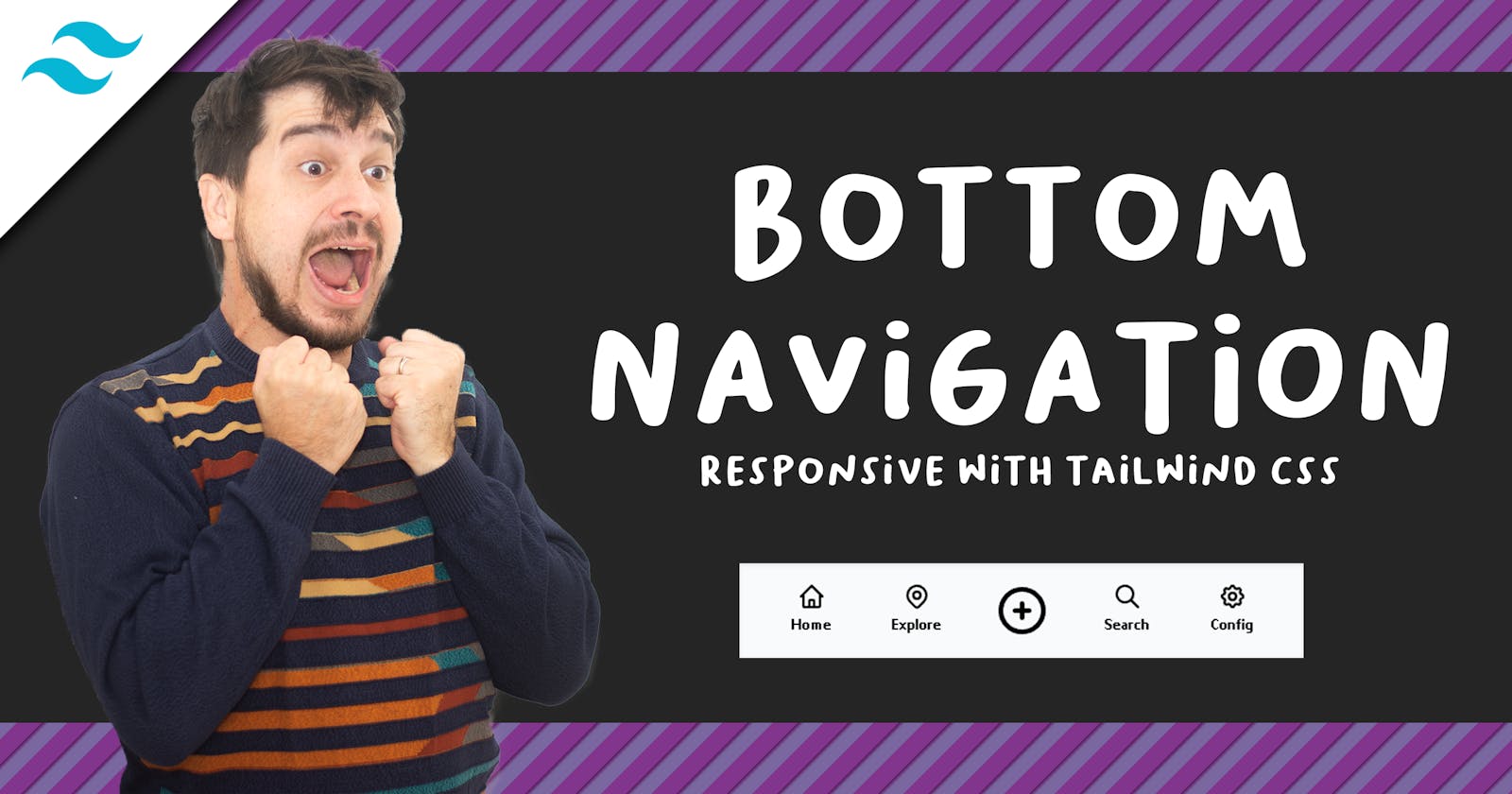


Good day, fellow reader. Today I want to share with you a simple snippet to achieve something simple, yet so important. Have you ever seen those mobile-like menus at the bottom of some apps? They usually have max 5 items and allow you to quickly, and easily access the main options of some app.
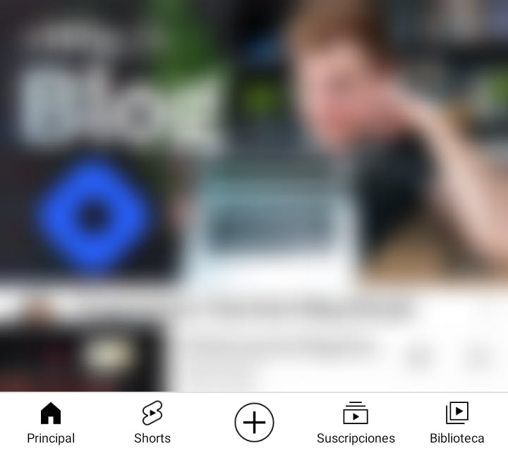 YouTube's bottom navigation
Are you familiar with TailwindCSS? Let's use it to make a similar one that changes to a traditional sidebar when viewport is bigger
Don't know TailwindCSS? You probably first want to read Chris Bongers and his honest opinion on Tailwind CSS and then head straight to its great documentation
UX and motivation
A while ago I read this article The thumb zone - designing for mobile users, and it brought to me a lot of concerns about UX. Sometimes we are so used to a particular type of navigation or components, that we don't take the time to ask the following question
Are we delivering a comfort navigation and a smooth user experience?
Having this in mind, for my next app (a PWA, actually) I wanted a sticky navigation bar like showed before, but changing to a more classical sidebar type when the viewport was medium or larger. Widescreens are getting wider every day, and this kind of navigation will definitively be ugly and uncomfortable with big resolutions.
Approach
Tailwind uses a mobile first breakpoint approach, this means every class we use is applied to the minimum size and larger, and every breakpoint we specify will be applied to that one and larger. That means if we try to add CSS for small screens, we usually don't use breakpoints at all.
For example:
<span class="hidden md:block text-xs pt-1">Add</span>
This will apply the following styles:
- hidden (
display: hidden;- This will not be visible on mobile) - md:block (
display:block;- on medium viewport and larger, this will be visible as block) - text-xs (
font-size: 0.75rem; line-height: 1rem;- small text on every viewport) - pt-1 (
padding-top: 0.25rem;- padding top)
Coding
With JIT mode, Tailwind allows a whole different experience when playing around with designs. But, for this small component, it's just great to use Tailwind Play.
Bad news
This article is not about how to use the CSS framework, or a how to tutorial, just a simple introduction to the problem and the Why.
Good news
Full code is available here, of course you can improve and modify it as you need. Click the HTML button to see the layout change.
That's it! Hope you find it useful. And if not, thanks for reading anyway.
See you around!